Friday, 21 February 2014
Analysis of Studio Idents
Studio Idents are very important to films for they present who has created the film. The most popular idents have a nickname: The big six.
The big six are
The big six are
- 20th Century Fox
- Paramount
- Warner Bros. Pictures
- Universal
- Columbia
- Walt Disney Pictures
Survey
For research I made a survey to find out what platform people watch movies and why they do it in this way. To do this I used survey monkey which was easy and simple to use.
https://www.surveymonkey.com/s/6HJPFT5 Here is the survey.
https://www.surveymonkey.com/s/6HJPFT5 Here is the survey.
Finding uncopyrighted music
Finding the music for our thriller has been very difficult as we have found lots of great music but not all of it will fit with the scenes.
We have tried to find music on many different sites but the main ones we have decided to use are:
http://www.purple-planet.com and:
http://www.unsigned.com/
We've decided to use some music that has been described as dramatic and tense. Also, we have found an edit of a song called 'turn around look at me' which fits perfectly with a specific scene in the thriller. This is from: www.soundcloud.com
However, we changed our mind on the music, for we thought it was not music which will engage our audience and be a tension and suspense building thriller. We also cut the music 'turn around, look at me,' for we thought that it didn't fit in properly with our film. In the end, we searched hard and finally found music which fit perfectly with our film.
Thursday, 20 February 2014
Choosing the font
We used a website called Dafont.com to find a cool font for our title sequences. It had many different fonts, ranging from Fancy to Techno. Whilst searching through the different fonts, we found a few which would go with our thriller. However, we wanted a basic font for our title, so that it would stand out without being too over the top.
We found a suitable font called Basic Title, which matched the description of the title we needed perfectly. We thought this would be good because the letters were very thin but still able to understand.

However, we then saw that although the Basic Title font was a good font for our thriller, the letters needed to be slightly more bolder, and so we ended up using Big Caslon, for it was bold, basic yet professional and stylish.


We found a suitable font called Basic Title, which matched the description of the title we needed perfectly. We thought this would be good because the letters were very thin but still able to understand.
Wednesday, 12 February 2014
Research into certification
"The British Board of Film Classification is an independent, non-governmental body which has classified cinema films since it was set up in 1912 and videos/ DVDs since the Video Recordings Act was passed in 1984." - http://www.bbfc.co.uk/about-bbfc.
"In order to protect children from unsuitable and even harmful content in films and videos and to give consumers information they might need about a particular film or video before deciding whether or not to view it, the BBFC examines and age rates films and videos before they are released. This independent scrutiny prior to release ensures the highest possible level of protection and empowerment." - http://www.bbfc.co.uk/what-classification/how-does-classification-work.Here are a few types of certificates which are given to movies:
 Suitable for all
  Parental guidance
  Cinema release suitable for 12 years and over
  Video release suitable for 12 years and over
  Suitable only for 15 years and over
  Suitable only for adults
  Adult works for licensed premises only
Monday, 10 February 2014
Editing
Editing is the process of examining all of the footage shot during the making of a film/programme and positioning it in the desired order.
There are two key areas to focus on with editing:
1. Speed of Editing- How long does each shot last?
2. Style of Editing- How each shot is joined to the next?
Speed of editing
In a film, each scene may last a few seconds, or it could continue for minutes, but the length of each sequence establishes the pace of the film moving the action along.
The speed of editing will help to figure out the mood of what is taking place on screen.
If the audience is to feel suspense and anxiety, the editing will be quick- the shots/scenes changing frequently. For example, in an action sequence.
In 'The Bourne Ultimatum,' the editing is very quick to try and keep up with all of the action taking place. This creates a tension/suspense throughout the scene to grab the audience's attention and capture all the action involved.
In 'James Bond- Quantum of Solace,' there is a slight contrast for it starts off slow and then gets faster when the fight scene shows, and once the fight is over, it returns to slow again.
If a relaxed mood is desired, the scenes last longer and change less frequently, for example in a romantic film, such as 'Sleepless in Seattle.'
A trailer for a film needs to pack in detail from throughout the film. Therefore the editing will be very fast.
In the 'Man in the iron mask,' there were 140 shots, give or take, throughout the trailer.
Scenes at the beginning of a film should be slower to introduce the main characters.
As the film progresses, scenes may become shorter as the editing cuts between two or more storylines at a time.
Style of Editing
This is how shots are linked together.
The movement from one shot to another is called a transition. Straight cut is the most common and "invisible" form of transition.
One shot moves instantaneously to the next without attracting the audience's attention.
Straight cuts help retain reality. they do not break the viewers suspension or disbelief.
Dissolves is fading one shot off the screen while another shot is fading in.
the audience will be able to see both scenes as the midpoint dissolves.
It is used if the film maker wants to show a connection between two characters, places or objects.
Fades is a gradual darkening or lightening of an image until it becomes black or white.
One shot will fade until only a black or white screen can be seen.
It is used to indicate the end of a particular section of time within the narrative. It can also show the passing of time.
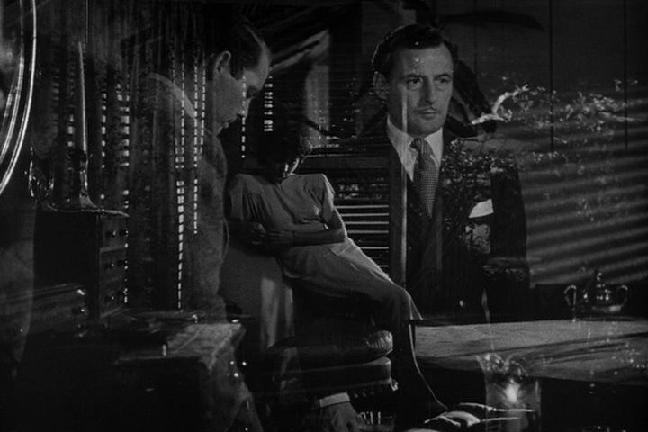
In 'Citizen Kane,' there are good examples of fades, dissolves and straight cuts.
It starts off with the black screen and gradually fades into a sign that says 'No trespassing.' It then uses an unnoticeable straight cut from the differences of the gate, and then another one which fades into a medium shot of the gate, also showing part of the background, which is a castle. These shots are only in the first 30 seconds of the footage, not including the titles, which is quite effective because it grabs the audience's attention from the start.
Wipes is when one image is pushed off of the screen by another image. Images can be pushed left or right.
It is more common for the image to be pushed off the left-hand side as this movement is more consistent with the sense of time moving forward. Wipes are used to signal a movement between different locations that are experiencing the same time.
For example, wipes are used broadly in the 'Star Wars' films.
A jump cut is where the audience's attention is brought into focus on something very suddenly. This occurs by breaking the continuity editing, which is known as discontinuity.
It appears as if a section of the sequence has been removed.
In the film 'Breathless,' the gap in action (when Seberg picked up the mirror) is emphasised by the use of a jump cut. It is used to startle the viewer and draw attention to something.

The filmmaker can choose to place shots in a certain order so as to create a smooth visual transfer from one frame to the next.
When two consecutive shots are matched in the terms of the way they look this is called a graphic match.
In 'A Space Odyssey,' there is a graphic match shown from where the bone is thrown and turns into an object in space.
Montage editing contains many different images, quickly edited together. Images do not provide a sense of the narrative moving forward, but are still full of meaning.
Rapid cuts force the viewer to consider the connections between the images being shown. There may be no obvious connections or they might be deliberately unconnected.
They are often used to reflect chaos, tension or disturbance, a characters state of mind perhaps. They might have an overall thematic or visual connection.
In 'Team America: World Police,' there is a good example of a montage.
Continuity editing retains a sense of realistic chronology and generates the feeling that time is moving forward.
It may use flashbacks or flash forwards but the narrative will still be seen to be progressing forward in an expected or realistic way.
Eye line match is when we see a character looking at something off screen and then we cut to a shot of what they are looking at.
Match on action is when we see a character start an action in one shot and then we see them continue it in the next shot.


The 180 degree rule is a basic guideline that states that two characters (or other elements) in the same scene should always have the same left/right relationship to each other.
If the camera passes over the imaginary axis connecting the two subjects, it is called crossing the line.

Shot/Reverse shot is used to show conversations/arguments.

There are two key areas to focus on with editing:
1. Speed of Editing- How long does each shot last?
2. Style of Editing- How each shot is joined to the next?
Speed of editing
In a film, each scene may last a few seconds, or it could continue for minutes, but the length of each sequence establishes the pace of the film moving the action along.
The speed of editing will help to figure out the mood of what is taking place on screen.
If the audience is to feel suspense and anxiety, the editing will be quick- the shots/scenes changing frequently. For example, in an action sequence.
In 'The Bourne Ultimatum,' the editing is very quick to try and keep up with all of the action taking place. This creates a tension/suspense throughout the scene to grab the audience's attention and capture all the action involved.
In 'James Bond- Quantum of Solace,' there is a slight contrast for it starts off slow and then gets faster when the fight scene shows, and once the fight is over, it returns to slow again.
A trailer for a film needs to pack in detail from throughout the film. Therefore the editing will be very fast.
In the 'Man in the iron mask,' there were 140 shots, give or take, throughout the trailer.
Scenes at the beginning of a film should be slower to introduce the main characters.
As the film progresses, scenes may become shorter as the editing cuts between two or more storylines at a time.
Style of Editing
This is how shots are linked together.
The movement from one shot to another is called a transition. Straight cut is the most common and "invisible" form of transition.
One shot moves instantaneously to the next without attracting the audience's attention.
Straight cuts help retain reality. they do not break the viewers suspension or disbelief.
Dissolves is fading one shot off the screen while another shot is fading in.
the audience will be able to see both scenes as the midpoint dissolves.
It is used if the film maker wants to show a connection between two characters, places or objects.
Fades is a gradual darkening or lightening of an image until it becomes black or white.
One shot will fade until only a black or white screen can be seen.
It is used to indicate the end of a particular section of time within the narrative. It can also show the passing of time.
In 'Citizen Kane,' there are good examples of fades, dissolves and straight cuts.
Wipes is when one image is pushed off of the screen by another image. Images can be pushed left or right.
It is more common for the image to be pushed off the left-hand side as this movement is more consistent with the sense of time moving forward. Wipes are used to signal a movement between different locations that are experiencing the same time.
For example, wipes are used broadly in the 'Star Wars' films.
A jump cut is where the audience's attention is brought into focus on something very suddenly. This occurs by breaking the continuity editing, which is known as discontinuity.
It appears as if a section of the sequence has been removed.
In the film 'Breathless,' the gap in action (when Seberg picked up the mirror) is emphasised by the use of a jump cut. It is used to startle the viewer and draw attention to something.
The filmmaker can choose to place shots in a certain order so as to create a smooth visual transfer from one frame to the next.
When two consecutive shots are matched in the terms of the way they look this is called a graphic match.
In 'A Space Odyssey,' there is a graphic match shown from where the bone is thrown and turns into an object in space.
Montage editing contains many different images, quickly edited together. Images do not provide a sense of the narrative moving forward, but are still full of meaning.
Rapid cuts force the viewer to consider the connections between the images being shown. There may be no obvious connections or they might be deliberately unconnected.
They are often used to reflect chaos, tension or disturbance, a characters state of mind perhaps. They might have an overall thematic or visual connection.
In 'Team America: World Police,' there is a good example of a montage.
It may use flashbacks or flash forwards but the narrative will still be seen to be progressing forward in an expected or realistic way.
Eye line match is when we see a character looking at something off screen and then we cut to a shot of what they are looking at.
Match on action is when we see a character start an action in one shot and then we see them continue it in the next shot.
The 180 degree rule is a basic guideline that states that two characters (or other elements) in the same scene should always have the same left/right relationship to each other.
If the camera passes over the imaginary axis connecting the two subjects, it is called crossing the line.
Shot/Reverse shot is used to show conversations/arguments.
Monday, 3 February 2014
Opening Sequence Titles
There are numerous titles that are at the start of every movie. They include:
- Ident - Production company (Galaxy Productions)
- Production company Presents (Galaxy Productions Presents)
- A film by - Director (Ropa)
- Male Actor (Chris Sullivan)
- Female Actor (Kamie)
- Title (Hunter)
- With... (other actors) (Sam Fuller)
- Editor (Kamie
- Music, Cinematography, Screenplay (Kamie, Ropa, Georgia)
- Producer (Kamie)
- Director (Ropa)
Research into title sequences
Title sequences are very important for the opening of films for they present who is starring in the movie, who the production/distribution companies are and the makers of the movie, such as the director and the editor.
After the name of the film appears on the screen, the music turns into thrilling and exciting music, which anticipates a chase or action of some sort.
Subscribe to:
Posts (Atom)